Financial Planning Firm · Pixel Nirvana · 2017–2018
Financial Planning Dashboard UX
A proof of concept for a real financial planning client. Designed the full advisor-facing UI, from risk questionnaire through portfolio modelling, simulations, and comparison, in a single coherent workspace.
Overview
While at Pixel Nirvana Design Studio, I designed the advisor-facing UI for a goal-based financial planning web app. The product needed to take an advisor and client from "what is your risk score?" all the way to "here is the portfolio that fits you," in one session, without switching between tools.
This was a POC for a real client. The brief covered risk questionnaire, portfolio creation, scenario simulations, and portfolio comparison, all within a single, structured interface.
Challenges
- Workflows were scattered across PDFs, spreadsheets, and separate tools, making client sessions slow and fragmented.
- Risk scoring and portfolio analytics were powerful but hard to explain; clients saw numbers without context.
- Scenario tools (stress tests, historical simulations) felt technical and visually inconsistent.
Goals
- Give advisors a single workspace to move from risk profiling to portfolio creation, simulations, and comparison.
- Use clear visualisation so risk, probability, and allocation are easy to understand in front of clients.
- Simplify data entry for holdings and assumptions while enforcing rules (e.g., single allocation must not be 100%).
My role
UI & Graphic Designer – Pixel Nirvana Design Studio
- Designed the full interface for the Risk Score Lite questionnaire, portfolio-creation flow, and analytics dashboards.
- Defined a stable goal navigation (Summary, Goal Analysis, Loss Simulation, Historical Simulation, Add Securities, Risk Analysis, Portfolio Comparison).
- Created charts for projected balances, risk scores, probabilities, historical returns, and portfolio comparisons.
- Worked with domain experts to translate risk logic into clear UI states, validation, and error messaging.
Process snapshot
- Mapped how advisors currently onboard clients, capture holdings, and discuss scenarios; reduced this to a linear narrative from "risk score" -- "model portfolio" -- "comparison."
- Prototyped layout with a fixed sidebar for steps, tabs for Recommended / Current / Model portfolios, and a large canvas for charts and sliders.
- Iterated on the risk questionnaire and portfolio-details screens: sliders for allocations, inline validation when single allocation is 100%, and clear "add another stock/asset" patterns.
- Refined visual hierarchy of the Risk Dashboard, highlighting client name, goal amount, time horizon, risk score, portfolio score, and each holding's contribution to risk.
Key design decisions
Linear narrative over modular tabs
The existing advisor process jumped between tools. We designed a fixed sidebar with sequential steps, Risk Score, Goal Analysis, Simulations, and Portfolio, so the session had a clear beginning, middle, and end. This also made it easier to train new advisors.
Charts over tables for client-facing views
Risk scores and probability data are hard to explain verbally. We used projected balance charts, donut allocations, and colour-coded risk gauges so advisors could show clients the data visually without interpreting raw numbers.
Inline validation on allocation inputs
A single asset allocation cannot be 100%, a business rule that caused errors in the existing spreadsheet workflow. We built inline validation directly into the allocation sliders so the constraint was communicated at the point of entry, not at submission.
Selected screens
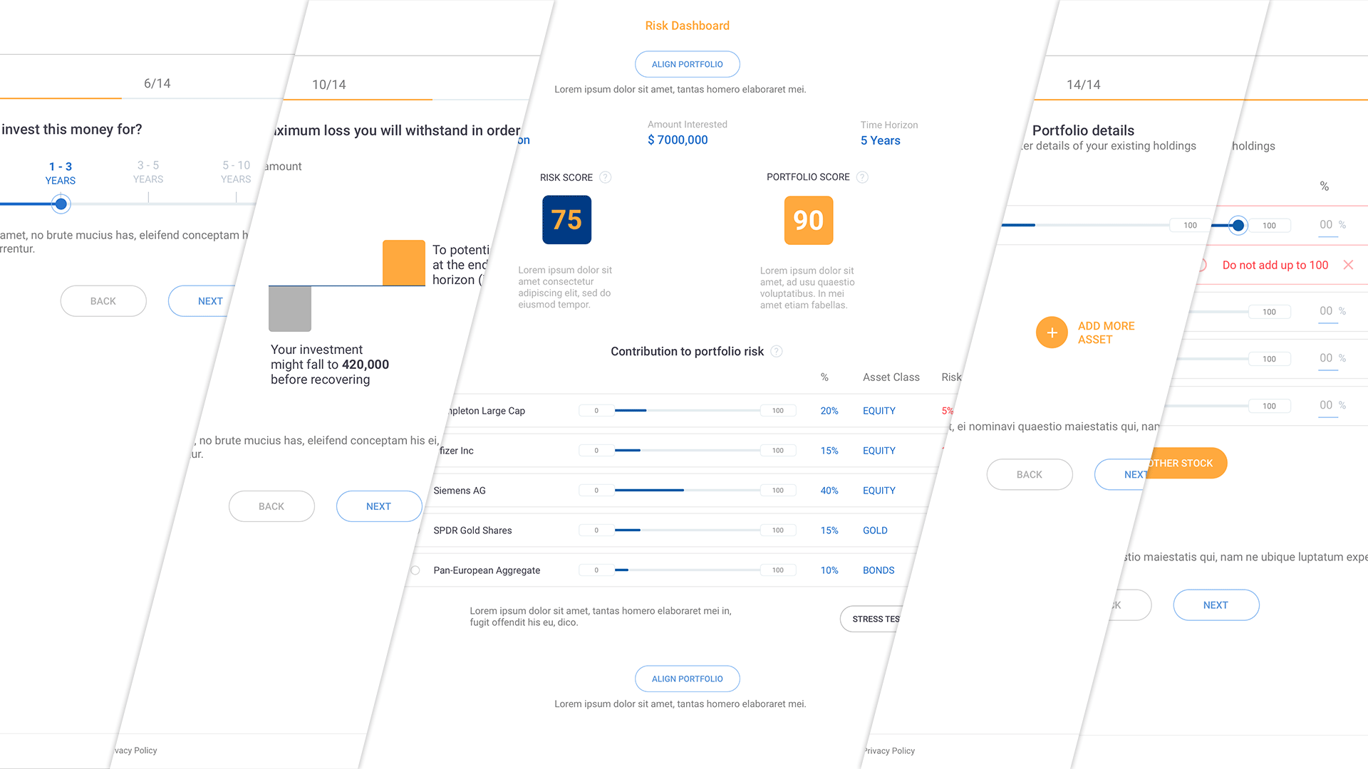
Risk Score process & dashboard
Multi-step flow that collects risk answers and existing holdings using sliders and inline validation, then surfaces a summary view of client risk score and portfolio score, with each holding's contribution to overall risk visualised through sliders and colour-coded percentages.
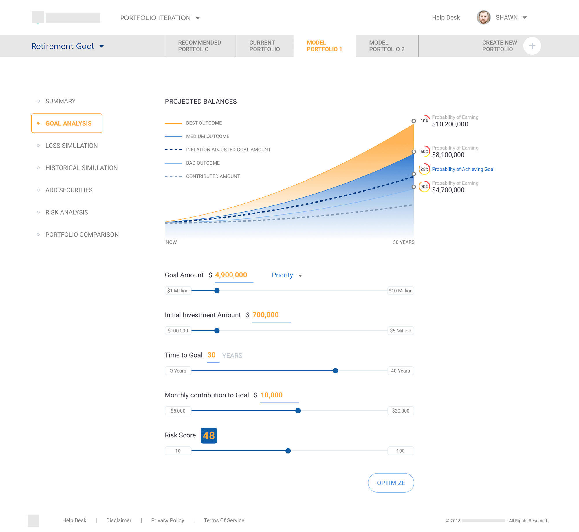
Goal Analysis
Projected balances graph with controls for goal amount, time to goal, contributions, and risk score, plus an "Optimise" action.
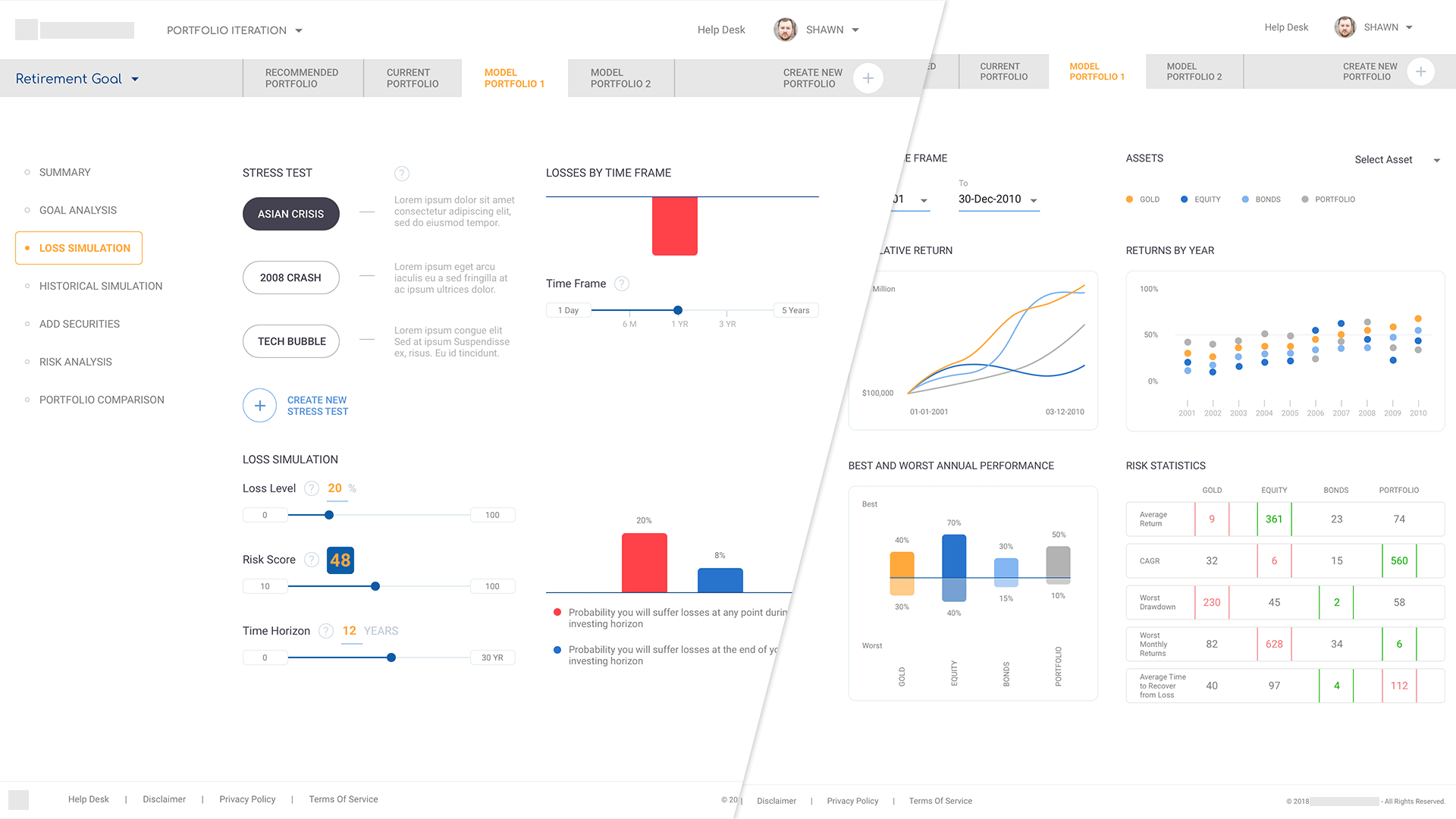
Loss & Historical Simulation
Visual tools showing stress scenarios and historical performance by asset class, with supporting statistics.
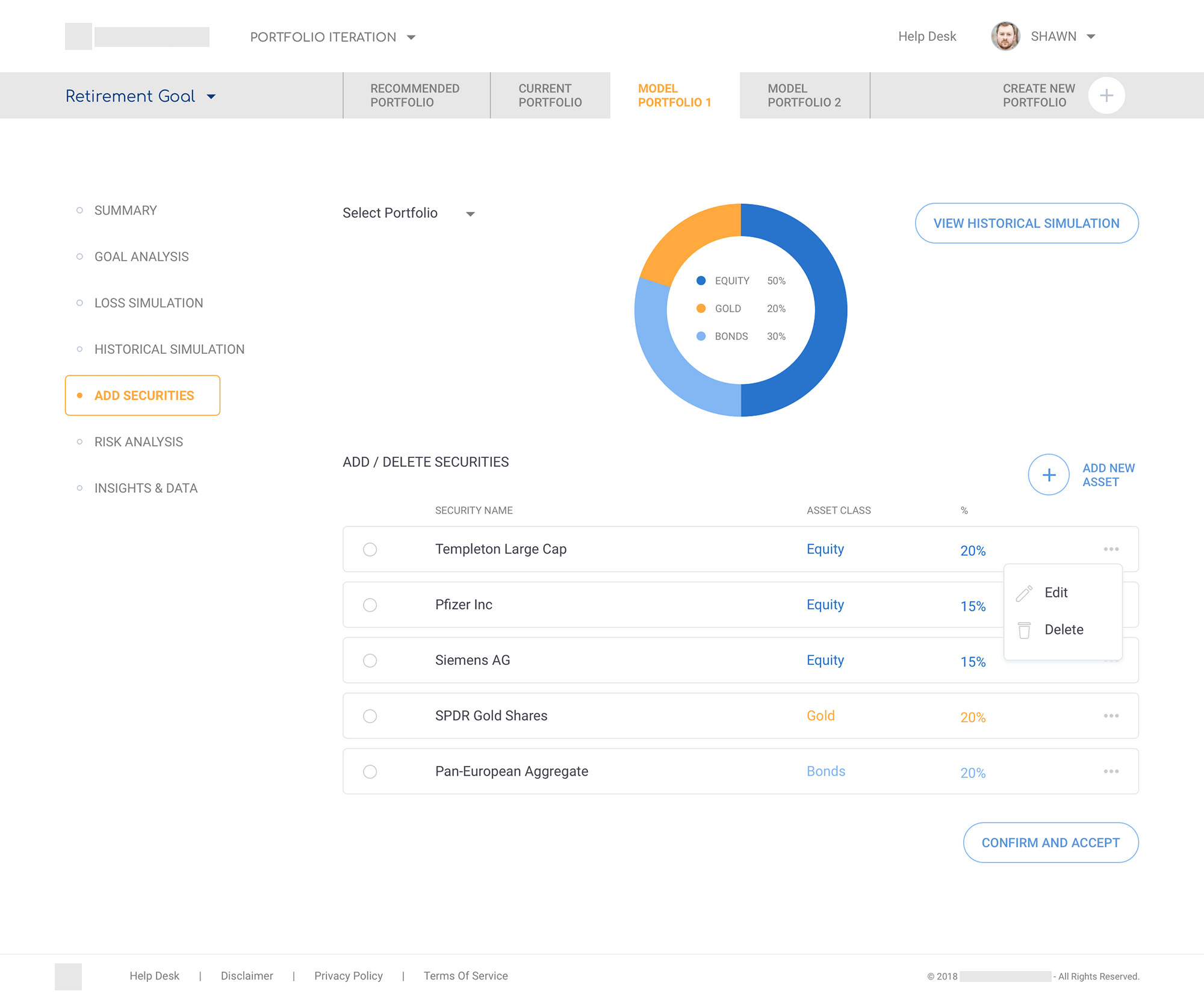
Add Securities
Donut chart summarising allocation above an editable table of securities; contextual menus for edit/delete.
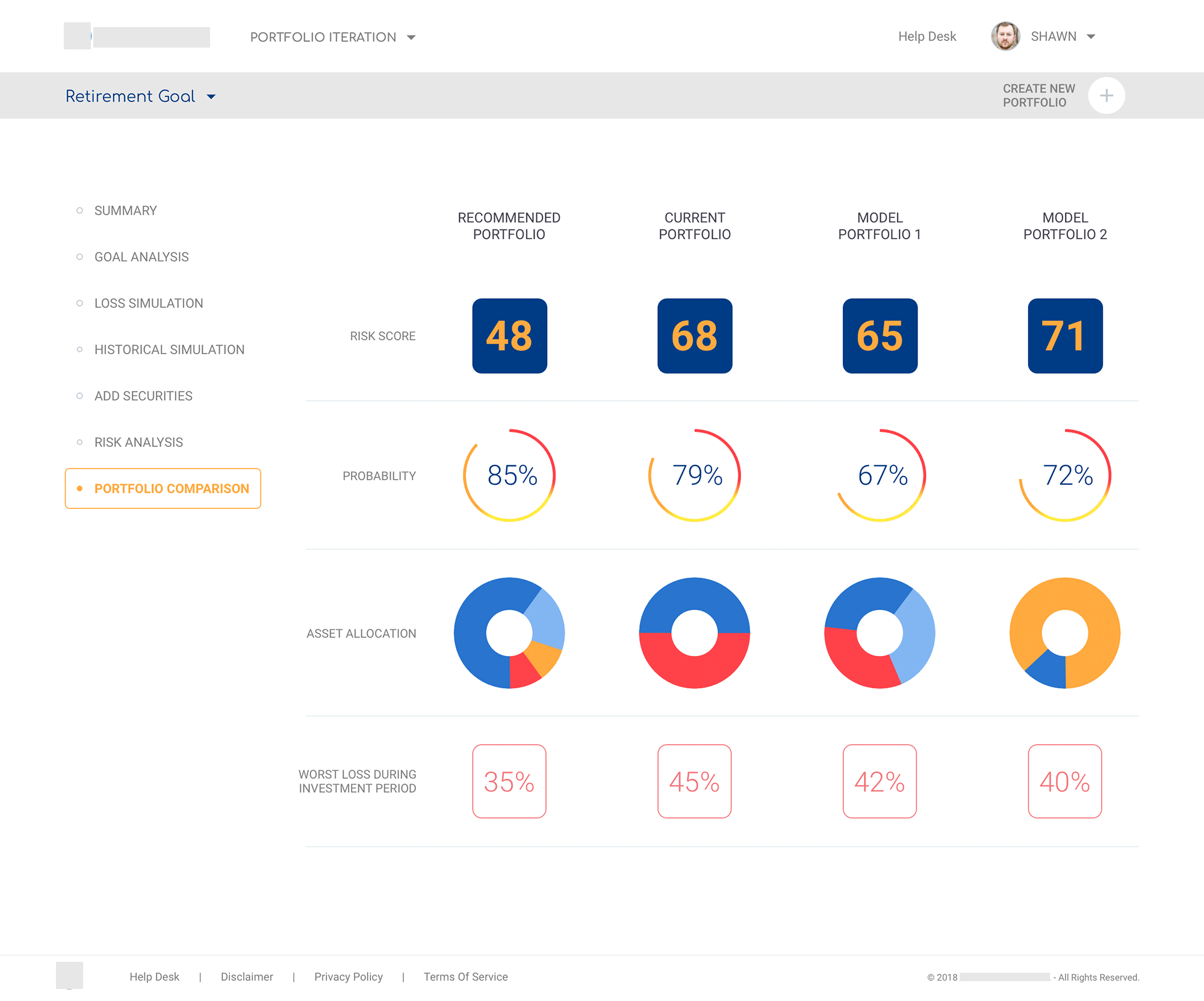
Portfolio Comparison
Side-by-side view of Recommended, Current, and Model portfolios using a row of risk and probability gauges, asset-allocation donuts, and worst-loss metrics.
Impact & reflection
The POC turned a fragmented, multi-tool process into a single session workspace. Advisors could move from risk profiling through modelling, simulations, and comparison without losing context. The project gave me deep experience in financial UX, particularly designing data visualisation that has to work in front of a client in real time, not just on a screen.
More case studies
Global automotive manufacturer · UST
Enterprise Data Catalogue Platform
An internal data governance platform used across the business: information architecture, multi-module workflows, role-based access, and a design system that held everything together across releases.
Pareza Group · Remote
Wallet & Chat Apps (White-label)
Three white-label mobile products for the African market. Built on a token-based system so partner brands could be rebranded without rebuilding the flows underneath.
Sports analytics startup · Agency project
Sports Analytics Dashboard
TV, social, search, and live audience signals consolidated into a single sponsorship index, giving brand marketing teams one place to read the numbers that mattered.
Selected visual work · Branding & UI