Pareza Group · Denmark · Remote · 2019–2021
White-label Wallet and Chat Apps
UI design for three white-label mobile products, a wallet, a chat app, and a supporting web tool, built for the African market. Designed a flexible visual system that could adapt across partner brands while keeping core payment and messaging flows consistent.
Overview
At Pareza Group I designed UI for a suite of three white-label mobile products, a digital wallet, a chat app, and a supporting web tool, targeted at the African market. The core challenge was building a visual system flexible enough for multiple partner brands while keeping the underlying payment and messaging flows consistent and trustworthy.
The products were designed and delivered but did not go to market, as the company closed before launch. The design work stands as a complete, production-ready UI system across two visual iterations.
Challenges
- Blend wallet, chat, and marketplace features without overwhelming the user or fragmenting navigation.
- Design a UI that could be white labelled for different partners while keeping a strong core identity.
- Make frequent actions, checking balance, sending money, paying bills, fast and trustworthy on small screens.
Goals
- Create a home experience where users can see balance, recent contacts, and common billers in one glance.
- Ensure core flows (send/request money, add funds, pay utilities) feel as simple as sending a message.
- Build a visual language and component set that can scale across Android and iOS with minimal rework.
My role
UI / Visual Designer – Pareza Group (Remote)
- Defined mobile UI foundations (type, color, iconography, components) across wallet, chat, and commerce.
- Designed core screens: onboarding, login, wallet home, payments, profile, chat list.
- Iterated the visual direction across two releases to improve hierarchy, contrast, and brand alignment.
- Created reusable patterns (recents, billers, navigation) to keep flows consistent across partners.
- Delivered production ready screens/assets and iterated with stakeholders and developers.
Process snapshot
- Started from flows and requirements for payments, chat, and bill payments; mapped them into a single navigation model with a persistent bottom tab bar.
- Prototyped the wallet home as a hub: balance and "New Payment" at the top, recents and suggested contacts in the middle, and common billers below.
- Refined micro interactions (e.g., balance reveal, quick add money) to make money tasks feel simple but safe.
- Ran a second visual pass when the brand evolved, tightening typography, simplifying curves, and clarifying icon sets while keeping the underlying structure intact.
Key design decisions
One navigation model for three products
Wallet, chat, and commerce could have been three separate apps with three separate navigation patterns. We unified them under a persistent bottom tab bar so users moving between sending money and sending a message experienced the same mental model throughout.
White-label through tokens, not redesigns
Partner brands needed different colours, logos, and sometimes different feature emphasis. We built the UI on a token-based system so brand changes could be applied at the theme level without touching component structure or rebuilding flows.
Trust signals on every financial interaction
For a fintech product in a market where mobile money was relatively new, every payment flow needed to feel safe. Confirmation steps, clear balance visibility, and consistent iconography for financial actions were non-negotiable, speed came second to confidence.
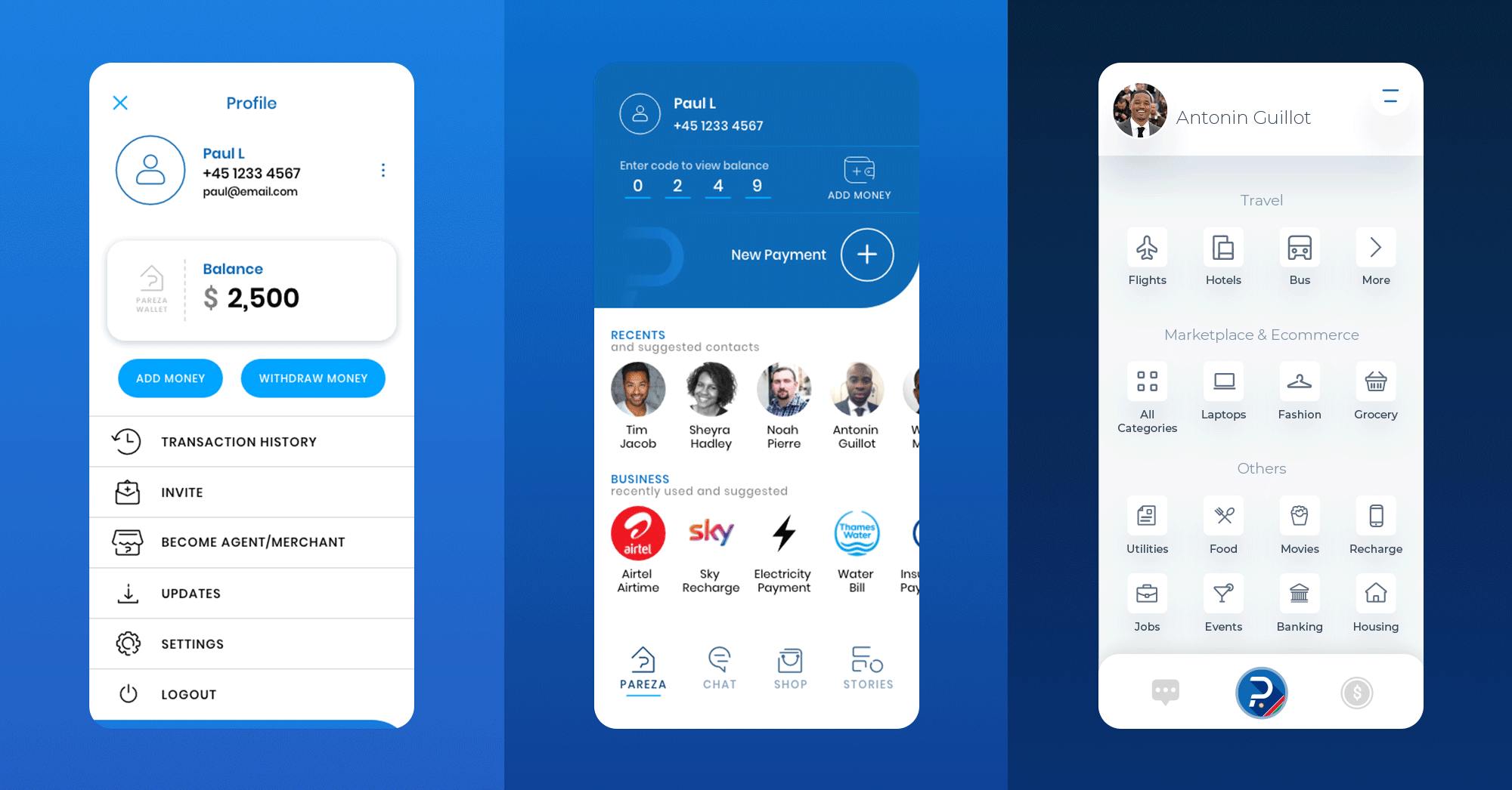
Selected screens
Launch & auth
Simple, brand-forward splash and login screens that set up the "wallet + chat" positioning before any data appears.
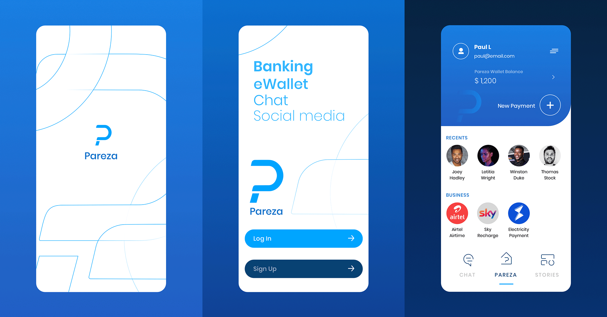
Wallet home & controls
Home view surfaces wallet balance, "New Payment" CTA, recent contacts, and suggested business billers for daily use, while the profile area extends this with a balance card, Add/Withdraw actions, transaction history, and key account options grouped into a clear vertical menu.
Impact & reflection
Delivered a complete, production-ready UI system across three apps and two visual iterations. The token-based approach meant brand variants could be applied without rebuilding flows, a pattern I've applied to design systems work since.
The products never launched due to the company closing. What the project gave me was deep experience in white-label product design, specifically how to build flexibility into a system without sacrificing consistency.
More case studies
Global automotive manufacturer · UST
Enterprise Data Catalogue Platform
An internal data governance platform used across the business: information architecture, multi-module workflows, role-based access, and a design system that held everything together across releases.
Financial planning firm · Pixel Nirvana · Web
Financial Planning Web App
An advisor-facing tool for goal-based financial planning. Risk questionnaire, portfolio modelling, simulations, and comparison brought together in a single workspace.
Sports analytics startup · Agency project
Sports Analytics Dashboard
TV, social, search, and live audience signals consolidated into a single sponsorship index, giving brand marketing teams one place to read the numbers that mattered.
Selected visual work · Branding & UI