Sports Analytics Startup · UK · Pixel Nirvana · 2017–2018
Sports Analytics Dashboard UX
Dashboard design for a UK-based sports analytics startup. Consolidated TV, social, search, and audience data into a sponsorship index that helped brands compare teams and make spend decisions at a glance.
Overview
While at Pixel Nirvana, I designed the main dashboards for a UK-based sports analytics startup (name withheld, NDA). The platform pulled TV, social, search, and audience data into a single sponsorship index, letting brands see which teams and sports actually delivered return on their sponsorship spend.
The challenge was making a data-heavy product feel navigable for marketing stakeholders who needed answers, not spreadsheets.
Challenges
- Sponsorship performance data lived in separate CSVs, reports, and tools, making comparison slow and manual.
- Marketing stakeholders needed high-level answers (Who should we sponsor? Is value going up or down?) without having to read dense analytics reports.
- Dashboards had to surface a lot of metrics, index scores, values, reach, demographic splits, without becoming visually overwhelming.
Goals
- Create a single dashboard view that summarises sponsorship value across countries, sports, and teams.
- Make it easy to compare teams and time periods and spot trends at a glance.
- Establish a reusable data-visualisation language for charts, tables, and KPIs that the startup could extend as new metrics were added.
My role
UI / Visual Designer – Pixel Nirvana Design Studio
- Defined the layout and interaction model for the main dashboard and comparison pages.
- Designed all charts (line, bar, donut, stacked bars) and KPI cards, including colour schemes and legends.
- Created a small design system for typography, spacing, and chart components so additional views could be built consistently.
- Worked with product and data teams to prioritise which metrics appeared in primary vs secondary positions.
Process snapshot
- Started from raw Excel exports and early wireframes, mapping which metrics decision-makers cared about most (index score, sponsorship value, reach).
- Grouped metrics into logical clusters: overall KPIs, trend over time, sponsorship breakdown, digital performance, and audience profile.
- Iterated on how to show team comparison, moving from complex tables to line charts + comparative bar charts so differences were obvious at a glance.
- Tested variations of colour coding and legends to keep multiple teams and sports visible without confusion.
Key design decisions
Metric clusters over flat data tables
The raw data covered dozens of metrics across TV, social, search, and audience. We grouped these into logical clusters, overall KPIs, trend over time, sponsorship breakdown, digital performance, and audience profile, so users could navigate by question rather than by data source.
Line charts for comparison, bars for ranking
Early versions used tables to compare teams. Moving to line charts for index trends and bar charts for team rankings made differences immediately visible. The visual encoding did the analytical work, so stakeholders could have a conversation rather than interpret a table.
Reusable chart components from the start
The startup planned to add new sports and metrics over time. I established chart patterns, colour schemes, and layout modules early so new views could be built consistently without redesigning from scratch each time.
Selected screens
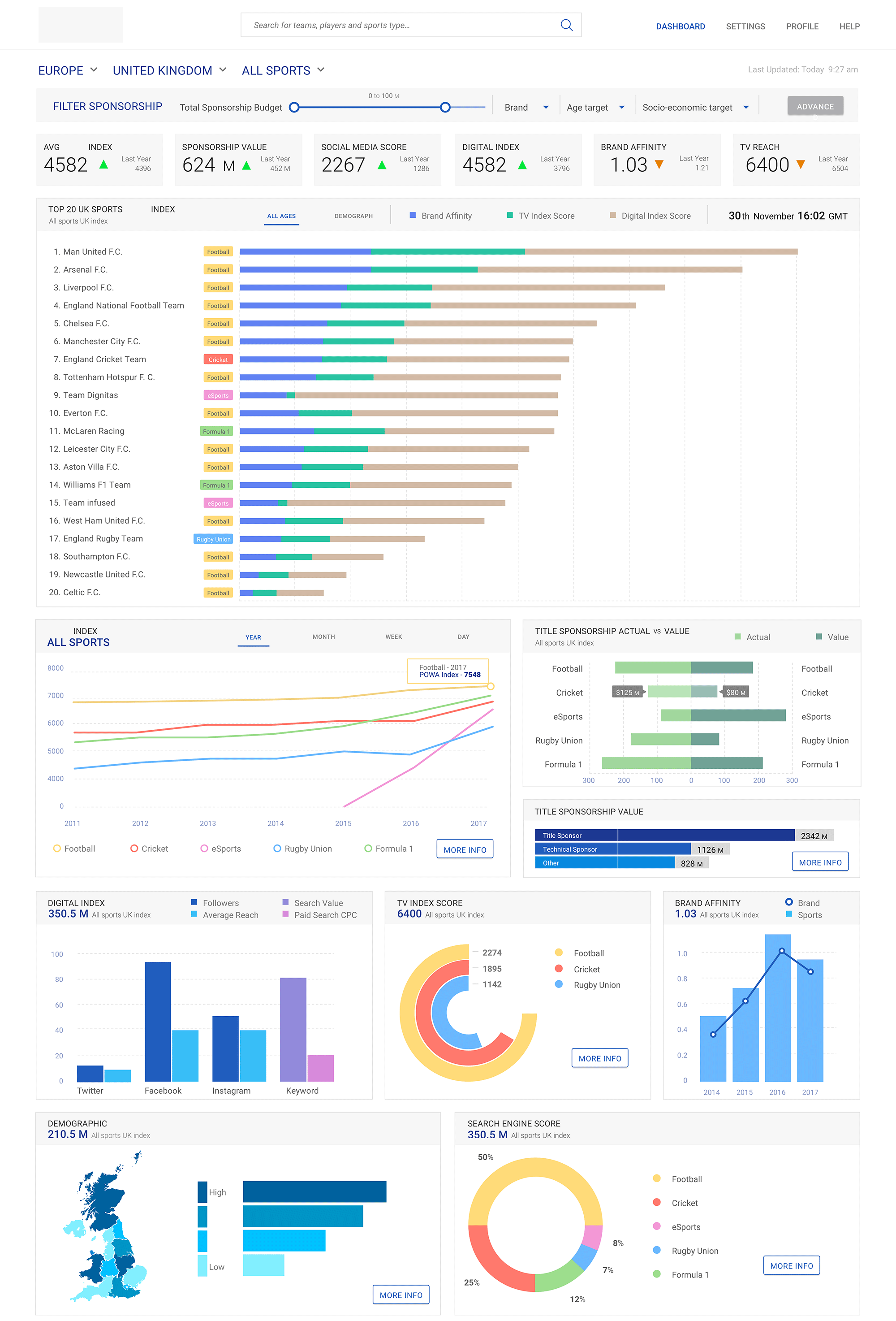
Global overview dashboard
Top-level KPIs across all sports and regions: sponsorship index, sponsorship value, social media score, digital index, brand affinity, and TV reach. Below, a multi-year index trend chart and a "Top 20 teams" bar chart show which clubs drive the most value, with supporting modules for digital index, TV score, search engine score, and demographics.
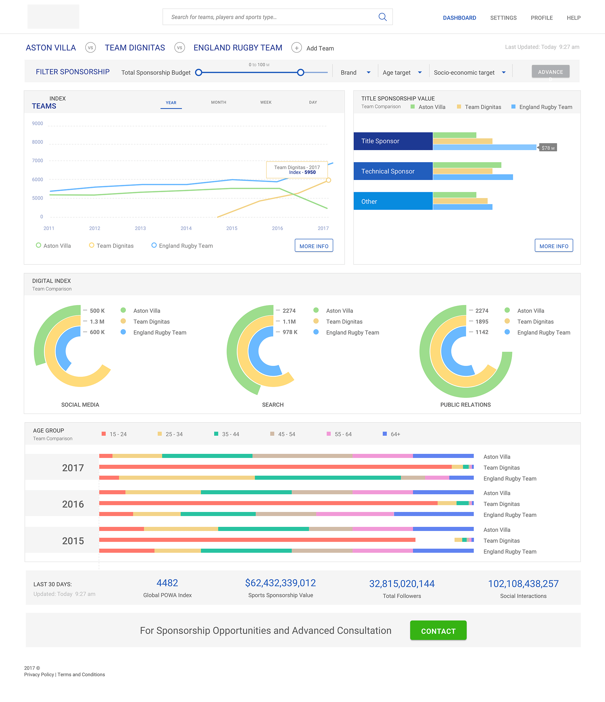
Team comparison view
Allows users to select multiple teams and compare them side by side. Includes a line chart of index scores over time, stacked bar charts for sponsorship value by partner type, donut charts for social/search/PR contribution, and age-group distribution bars for audience profile.
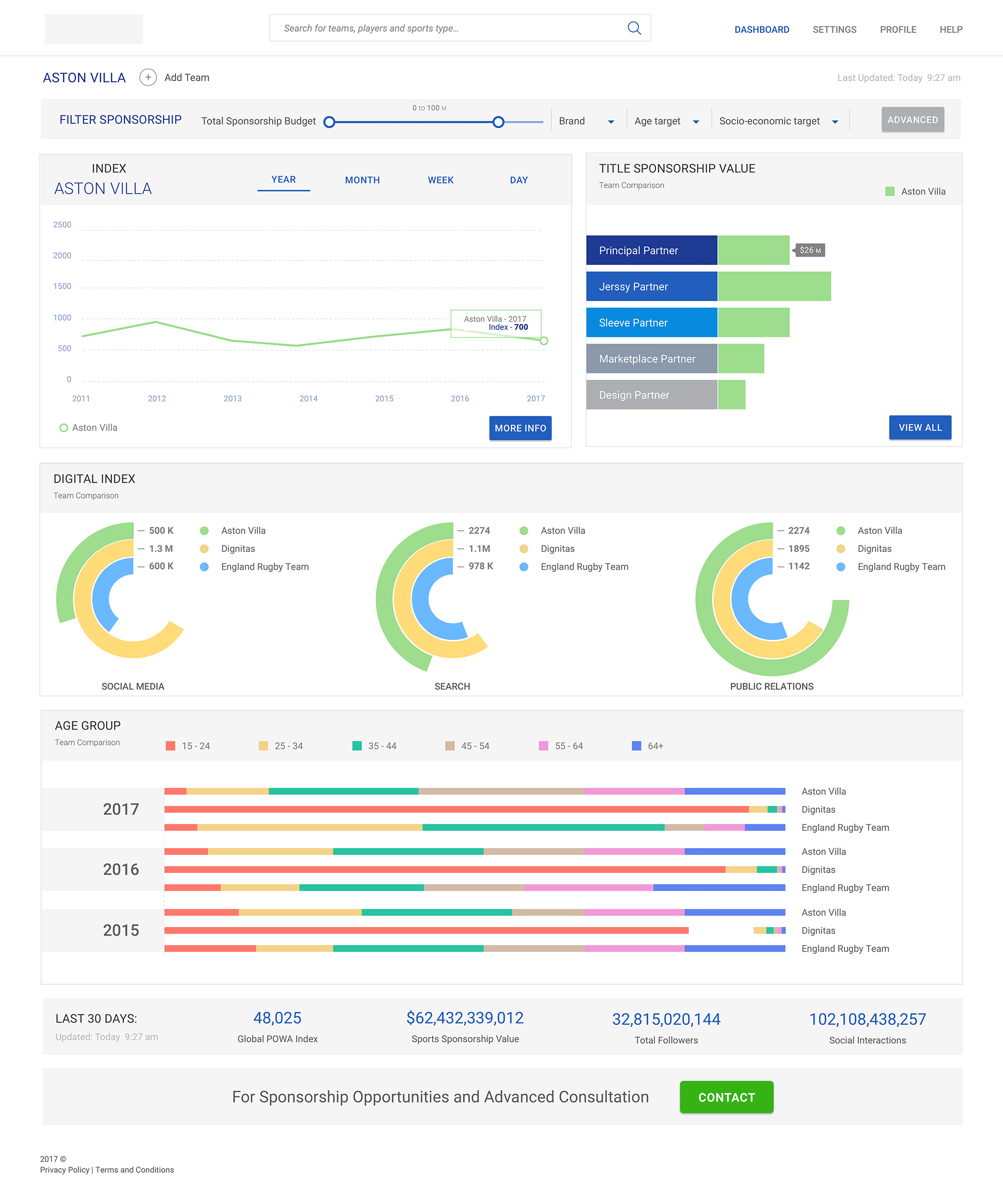
Single-team deep dive
Focused view for one team showing its index trend, sponsorship value by partner tier (principal, jersey, sleeve, etc.), digital performance donuts, and audience demographics. Designed to support both high-level storytelling and detailed discussions with sponsors.
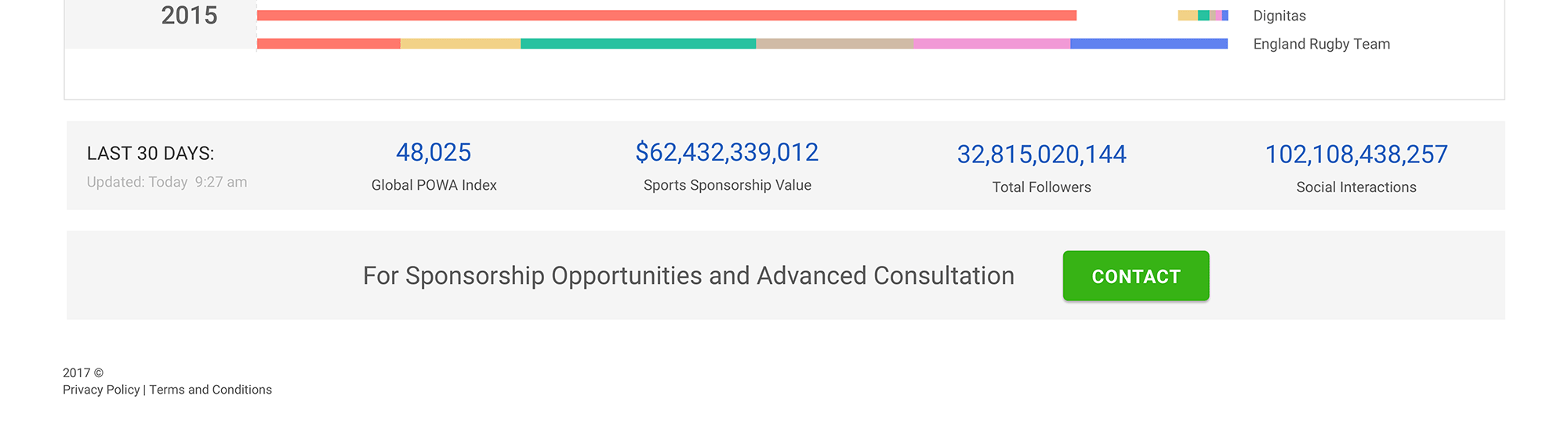
KPI footer strip
Repeated summary section showing last-30-days index, total sponsorship value, total followers, and social interactions, giving a quick health check no matter where the user is in the dashboard.
Impact & reflection
Delivered presentation-ready dashboards that let brand teams benchmark teams, track trends, and compare sponsorship value without digging through separate reports. The chart patterns and layout modules held up as new sports and metrics were added later.
This project sharpened my approach to data-heavy UI, specifically how to reduce cognitive load on dashboards where every metric competes for attention.
More case studies
Global automotive manufacturer · UST
Enterprise Data Catalogue Platform
An internal data governance platform used across the business: information architecture, multi-module workflows, role-based access, and a design system that held everything together across releases.
Pareza Group · Remote
Wallet & Chat Apps (White-label)
Three white-label mobile products for the African market. Built on a token-based system so partner brands could be rebranded without rebuilding the flows underneath.
Financial planning firm · Pixel Nirvana · Web
Financial Planning Web App
An advisor-facing tool for goal-based financial planning. Risk questionnaire, portfolio modelling, simulations, and comparison brought together in a single workspace.
Selected visual work · Branding & UI